One of the funniest McSweeney's pieces you'll ever read is a message to haters from the font Comic Sans. Slighted by the perception that he's "pedestrian and tacky," Mr. Sans argues he's actually "the life of the party." He shreds a double-necked Stratocaster, races Tokyo gangsters, and sleeps with prom queens. He insults Helvetica ("stark Eurotrash Swiss type"), Gotham (science fair geek), Avenir (clarinet player), Univers (busy filling allergy prescriptions), and all the other safe font selections out there.
And at the end he goes and gets drunk with Papyrus.
It's not news that typefaces have distinct personalities. But until recently, the implications have been poorly understood. The latest evidence suggests that typefaces convey their own meanings and elicit their own emotions independent of the words they spell out. That distinction is critical. From a design standpoint, that means matching typeface personality with message personality becomes far more important, and potentially far more challenging.
"Academics are doing a better job of understanding how typeface choice affects the emotional responses we can expect from the viewer or reader," Nicole Amare, a communications scholar at the University of South Alabama, tells Co.Design. "And we are getting better at understanding how very specific emotional responses are linked to the forms of the letters and words on the page or screen."
(Technical note: Fonts differ from typefaces in the way MP3s differ from songs; one is a delivery mechanism, the other a creative item. But the terms are often used synonymously, even in the research literature.)
People have been assigning character to typeface for ages. Ancient Greeks and Romans saw serif letters as "symbols of the empire." Renaissance type carried nationalist undertones: Fraktur for Germany, Garamond for France, Bodoni for Italy. Some of the earliest research on fonts, conducted in 1923, found clear cultural associations: Simple types like Cheltenham Bold or Century Bold conveyed economy and strength, and so were fitting for such products as coffee and cars; ornate types, including Caslon Old Style Italic and Typo Slope, conveyed luxury, and worked well for jewelry and perfume.
Studies done in the past decade or so have identified the range of type traits with more precision. Broadly speaking, serif types are more focused and organized and calm than sans serifs--and much more than scripts. Rounder types elicit happiness; sharper types, anger. Odd spacing can be interesting but aggressive; consistent spacing feels professional but boring. Some work argues that most typefaces can fit into three personality groups: elegant, friendly, and direct.

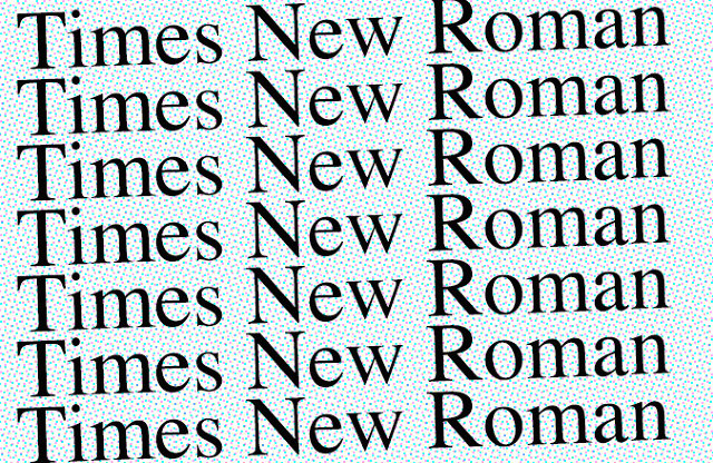
A 2004 study in which 63 students rated 15 common typefaces remains one of the most detailed personality profiles on record. Times New Roman emerged as the most professional and most formal type (though people also labeled it "common"). Courier New was the least friendly. Helvetica ("very blah" with "no excitement") was the least dramatic and artistic. Script took home both titles, as well as most elegant. Lucida Console felt most futuristic by virtue of odd spacing. Comic Sans rated as the least formal type; it was "too childish."
People also tend to have an innate sense of when a type fits a situation. Participants taking speed identification tests respond faster when a font is paired with an matching description (the word "heavy" in a bulky font) than when there's a mismatch (the word "heavy" in an airy font). Those reaction times hold true for metaphorical descriptions--replacing "heavy" with "elephant," for instance. In a 2003 study, participants rated a friendly font (such as Bauhaus) as most appropriate for a friendly text (a common magazine piece), even without knowing that the type and the text have been pre-tested for friendliness.
Identifying the proper type for a situation can of course have huge implications for brand designers. The most direct evidence for this impact, published in 2004, offered test participants two identical boxes of chocolate truffles named Temptation or Indulgence. Sometimes the names appeared in Signet Roundhand, an ornate script type; sometimes they appeared in Salem, an aggressive bold type. Thirty of 40 participants chose a box in Signet, whatever its name--a sign that when brand names are equal, a fitting font may prove the decisive consumer factor.
The stakes are high for media design, too--typeface may hold the power to influence the message at hand. Several years ago, a pair of New York University psychologists asked 102 test participants to read two satirical New York Times essays by William Safire, and then asked them to rank the pieces on 11 descriptors. Those who read the essays in a Times New Roman font perceived the article to be funnier and angrier--in other words, more essentially satirical--than those who read them in Arial. The personality of the typeface enhanced the voice of the writing.

That's not to say there's a perfect font for every situation. Many types are versatile (hello, Georgia); others are too similar for most eyes to distinguish (yes you, Times and Times New Roman); some are clearly meant for display rather than reading (looking at you, Cooper Black). And the power of typeface personality is limited in scope. The right font might make a satirical text more satirical, for instance, but that doesn't mean the wrong one will make it depressing. The words themselves still matter.
Unless we're talking about Comic Sans. Amare, the South Alabama scholar, included the font in one of her recent studies on the emotional effects of typeface. Whereas most fonts trigger one emotion more sharply than others, Comic Sans produced spikes across the emotional spectrum--from agitation to calm. It's basically a rollercoaster of emotions wrapped in a few playful curves. People either love it or hate it.
"Comic Sans has become sort of a cultural icon--or pariah!--in the design world," says Amare. Just for fun, she recently changed part of a website that she helps manage to Comic Sans, to observe reader response. And then received emails requesting the type be changed back immediately because it was unprofessional. Interestingly, once she switched the text to Times New Roman, other users told her they kind of missed the "fun" type, and now found the site "somehow duller, boring, and more mundane."
At some bar somewhere with Papyrus, Comic Sans is saying, "I told you so."
No comments:
Post a Comment