A recent photo posted online revealed a fascinating history of the lengths TV stations would go to for dynamic logos.
Today, incorporating physical objects into digital design is a way to create a unique aesthetic or a new perspective on a project. For example, to design the icons for Google’s Material Design language, designers cut and folded paper prototypes of the icons before translating them into digital pixels. Similarly, the designers behind the opening sequence of Stranger Things rigged up a manual light-based stencil system to capture the grainy, organic vibe of the credits.
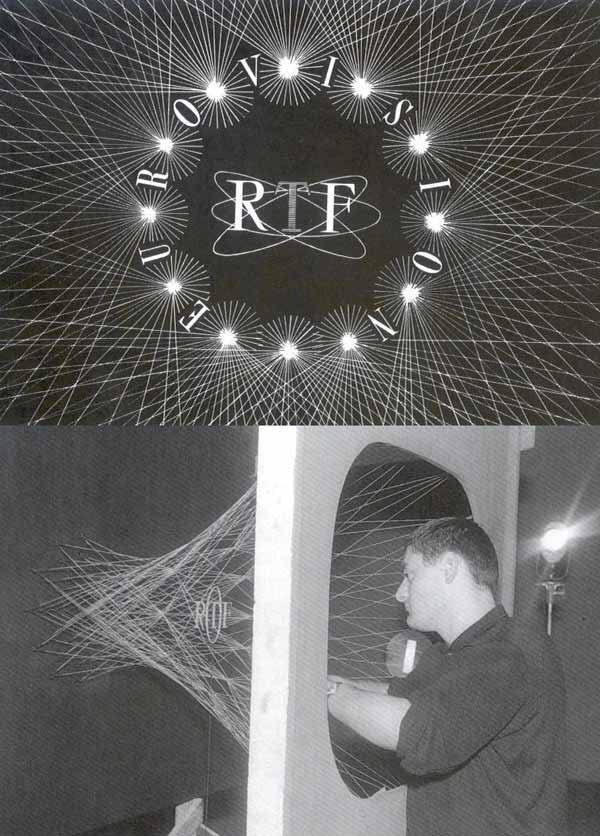
It’s easy to forget that there was a time when every identity design or title sequence was made physically, as a recently unearthed photo that shows the making of the 1962 Office de Radiodiffusion Télévision Française logo reminds us.
The photo depicts the TV channel’s shimmering logo as a physical installation–what looks like a tunnel of strings with the RTF word mark floating in the center. It shows the lengths to which the television company went to produce a dynamic logo that went beyond the 2D marks of the day. An archival video shows the result of the intriguing contraption–the quivering strings create an animated shimmering effect:
The original photo, which was found by television history buff Andrew Wiseman and published by This Is Colossal, opened up an interesting discussion online about other midcentury logos that originated as physical objects. After it was posted to Reddit, a slew of comments revealed other logos of the time that used a similar approach.
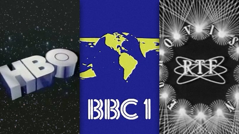
The BBC, for instance, has used many mechanical models and dioramas to create its idents in a pre-digital world, including its very first logo:
Another noteworthy example? The 1969 BBC1 logo, nicknamed the “mirror globe” ident. The logo was made using a device created by the BBC to film its idents called the Noddy camera. With the novel system, announcers could control the camera remotely, directing it to pan and tilt or move both vertically and horizontally across a matrix of prearranged physical objects.
In the case of the BBC1 logo, the object was a rubber ball-sized globe rotating in front of a concave mirror. The oceans were painted on the globe in metallic black paint, and the land masses were left unpainted. The camera filmed the rotating globe in black and white, then added in the color.
In another example, a 1983 video by HBO shows the behind-the-scenes making of an opening it made to introduce its new programming during the same year. It starts with a viewer watching HBO on his television in his apartment. Then the camera pans out through the window and through the entire city with an aerial view.
“The shoot that they were trying to do, they couldn’t do with an actual city,” James Kowalski, the networks director of special effects at the time, says in the video. “They couldn’t run down the middle of a city with a helicopter or shoot it out of a plane, or what have you.” Instead, they built a model city, hiring six craftsmen to create over 100 model buildings, hundreds of handmade trees, cars and buses, even tiny street lamps.
Meanwhile, the HBO logo was crafted from chrome-plated brass, filmed sitting on a table, then overlaid with special effects to create the visual of the HBO logo floating in from outer space.
The oldest and most famous example of a physical logo in TV sequences is the MGM lion. The mark was created using a series of trained lions, the most famous of which was Leo the Lion, introduced in 1957. Though methods this extreme are no longer needed to design animated logos, the ingenuity designers used back then is inspiration for today. If nothing else, these physical logos are good examples of the value of design constraints.


No comments:
Post a Comment